Those who would walk into your home or office trying to sell insurance are indeed bringing bad omen where they would say “what if “the unfortunate or the unforeseen happens.
They would additionally inquire whether you have the resources to recover from the loss, or if the worst happens, whether your loved ones could bear the issues of the future.
The questions are many and if you are convinced, most of us do, we would take out an insurance policy and cover ourselves with a compensation blanket.
Today that has somewhat changed with online websites selling insurance of many types and it is important for these companies to ensure that they strategize their online efforts.
Visitors coming to their landing pages need to be told what is on offer in the least possible ways, but limited to words, images and possibly video.
We look at some of these success stories, which have great landing pages and get constant leads online.
#1. State Farm home insurance landing page
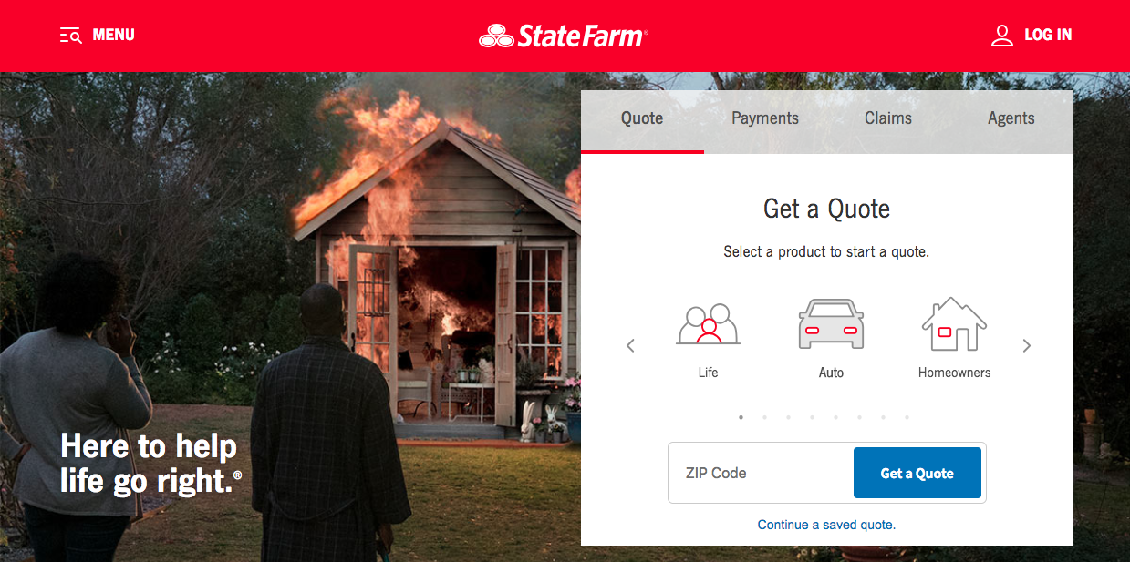
- The headline does not look as impressive as it should be
- The by headline does some help because it provides a benefit
- The logo being linked to the homepage does not do justice
- The homepage is primarily targeting parents
- A car for the young lad presumably with insurance
- The USD 500/- saving is highlighted but no further information
- As to how this benefit of USD 500/- could be availed is not told upfront
- CTA – Call to Action is there but could be more forcefully presented
- The landing page provides less information and is not catchy enough
#2. Esurance insurance lead capture page
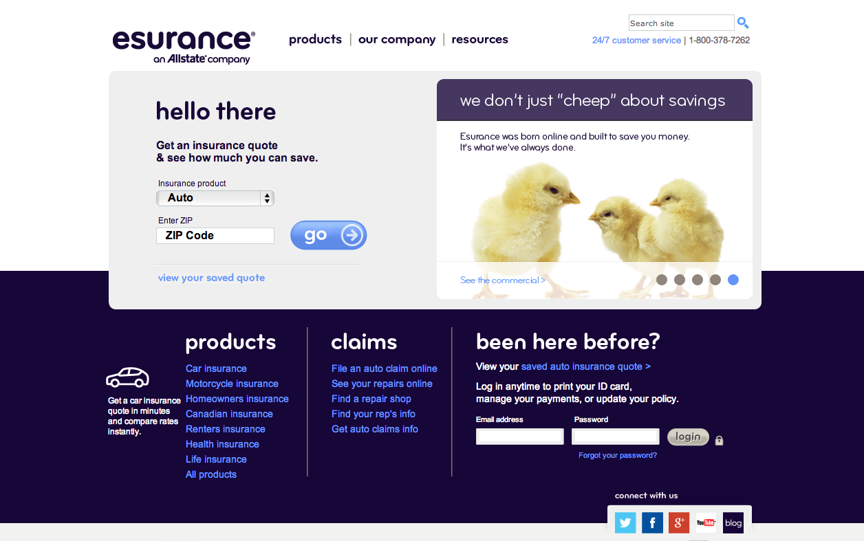
- No clutter of words
- Kept very simple
- Addresses the visitor directly with a “You”
- The CTA is prominent
- Easy to navigate
- Savings advice as bullet points, this creates interest
#3. AARP insurance quote landing page
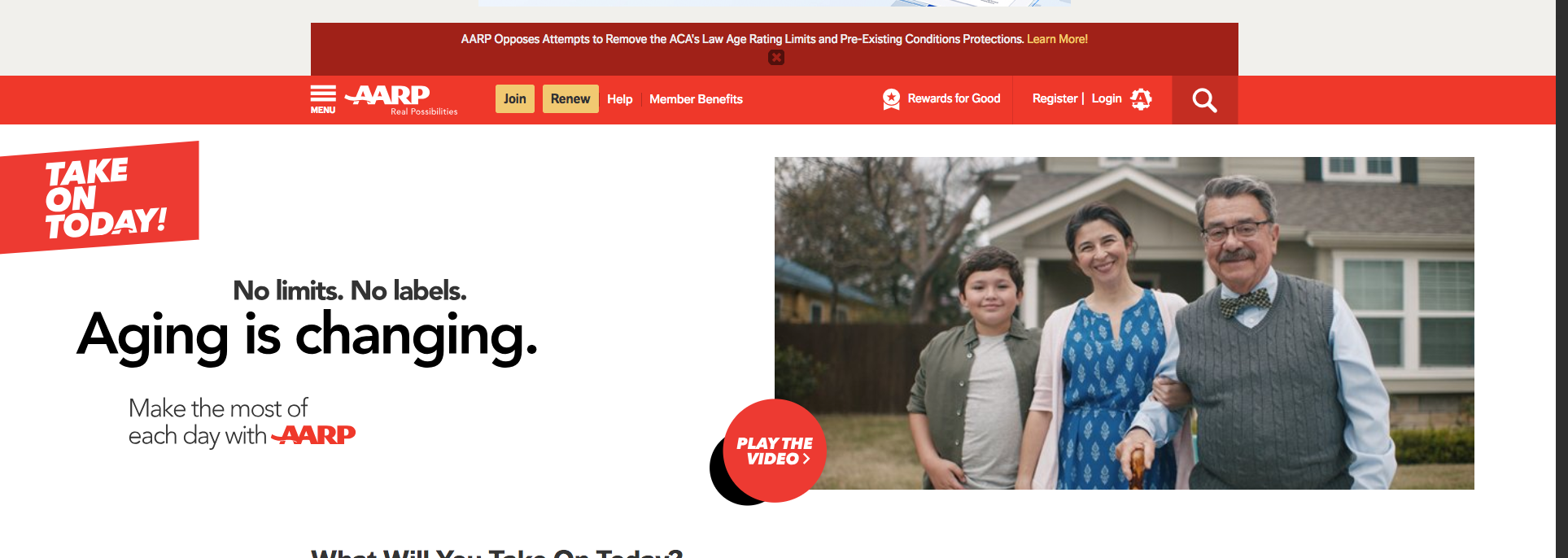
- Too much of information is also crowded
- It looks like they are telling too many things at once
- The splash of colors is ok
- The CTA button could have been better in another color
- Visitors may not read everything
- Some salient points would have been sufficient
- When there is all this information visitors may move onto other sites to compare
- Minimum but important points and CTA should do
#4. ObamacarePlans.com health insurance landing pages
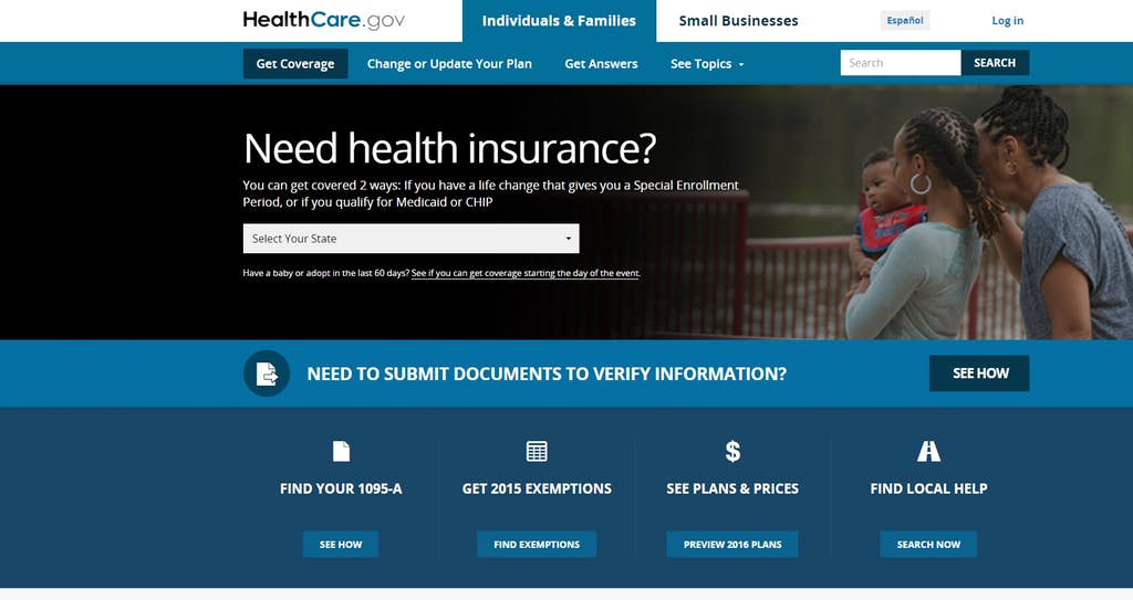
- Very simple and open
- A question at the top, a relevant one
- The answer is provide, a good one
- No clutter of words
- CTA is kept n abeyance
- A more forceful CTA would have allowed quick reaction
#5. Farmers life insurance landing page
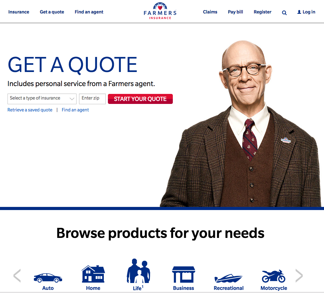
- A landing page would need to give something
- There is none in this
- Visitors like a quick reward
- Only then would they be jolted to act
- CTA is prominent
- The “Smart Home” is a bit confusing
#6. Travelers auto insurance landing pages
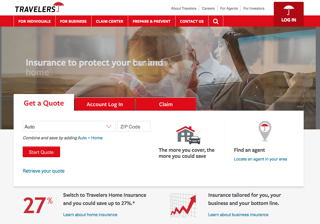
- Too much of the same color – Red!
- The CTA button could be missed in the melee!
- The lower part of the page has a clutter of information
- This clutter does not do justice to the top of the landing page
- The SAVE in the landing page is lost at the bottom
- This should have been the focus
#7. Aflac landing pages for insurance agents
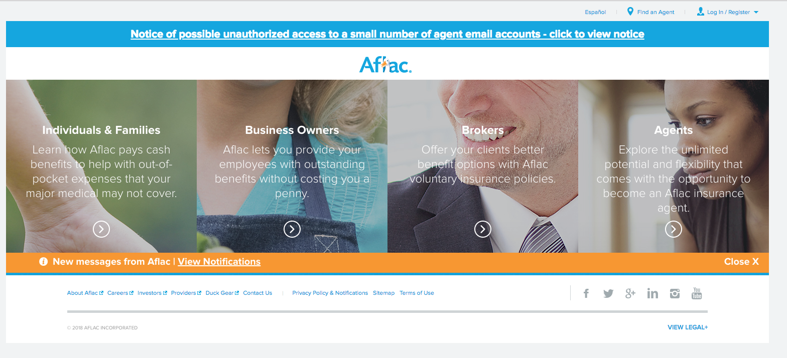
- Looks too crowded
- CTA is a “continue”
- Should have been just one click to engage
- The landing has too much to say
- Visitors would not have the time to read all of it
- By the time a visitor reads a few of the sentences he would have got bored
#8. Allianz insurance landing page
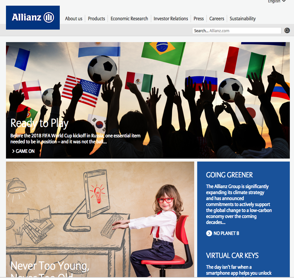
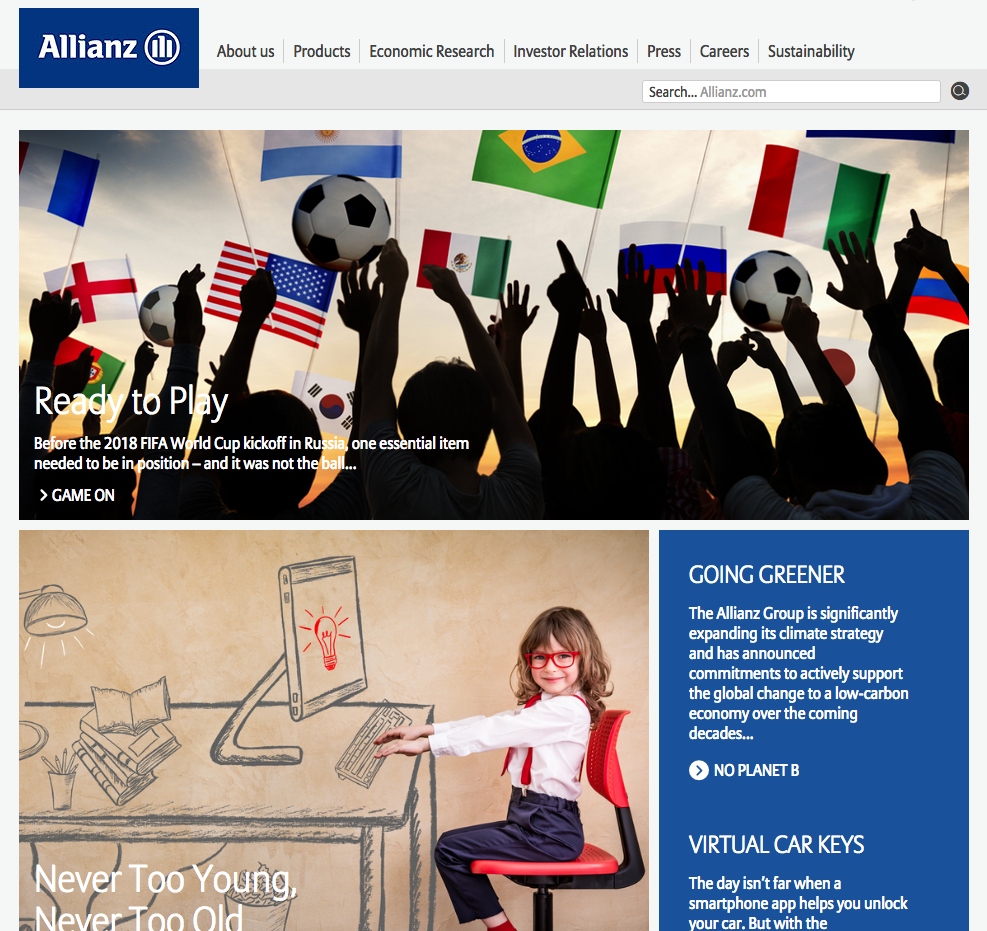
- Does not look simple but full of information
- The CTA should not mention “next” that is confusing
- A simple click, should have been effective
- A contact telephone provided, that is good
- The visitor needs to do many things
- That is something they will not do
- Too complicated landing page
#9. Geico lead capture page
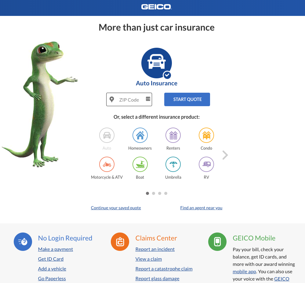
- Simple very little text
- The gecko tells all
- CTA is the objective
- No unnecessary information
- Interest is generated with simple information
- The little information provided stands out well
- Is it too simple to be true? Would it digest well, it would!
#10.Colonial life landing pages for insurance
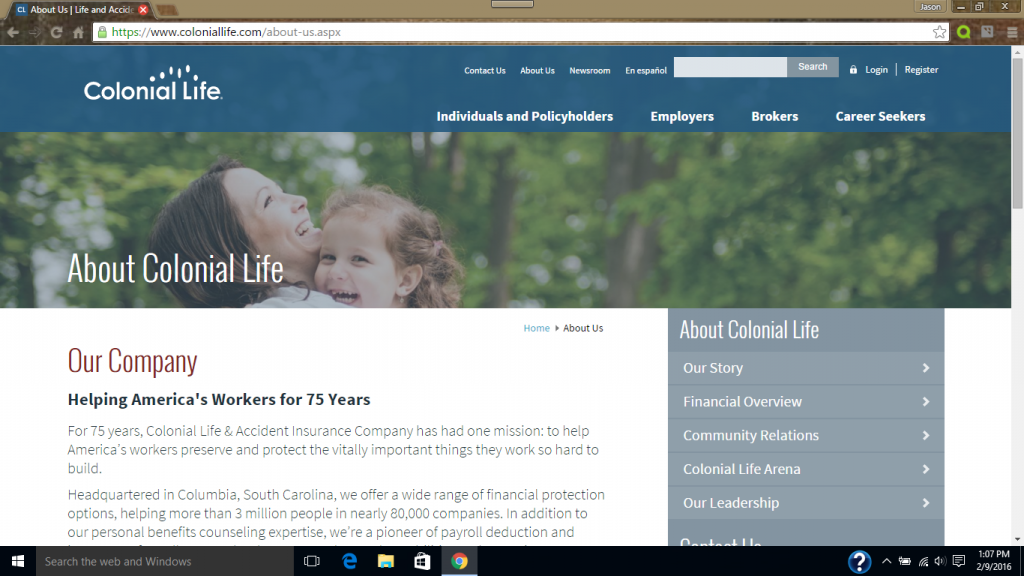
- A collective policy statement
- Very well presented with information
- Directed at companies
- They would know what they would be offered
- The design is simple
- Message is well presented
- The CTA is the objective
- It details all information needed
#11.insuratrip.com
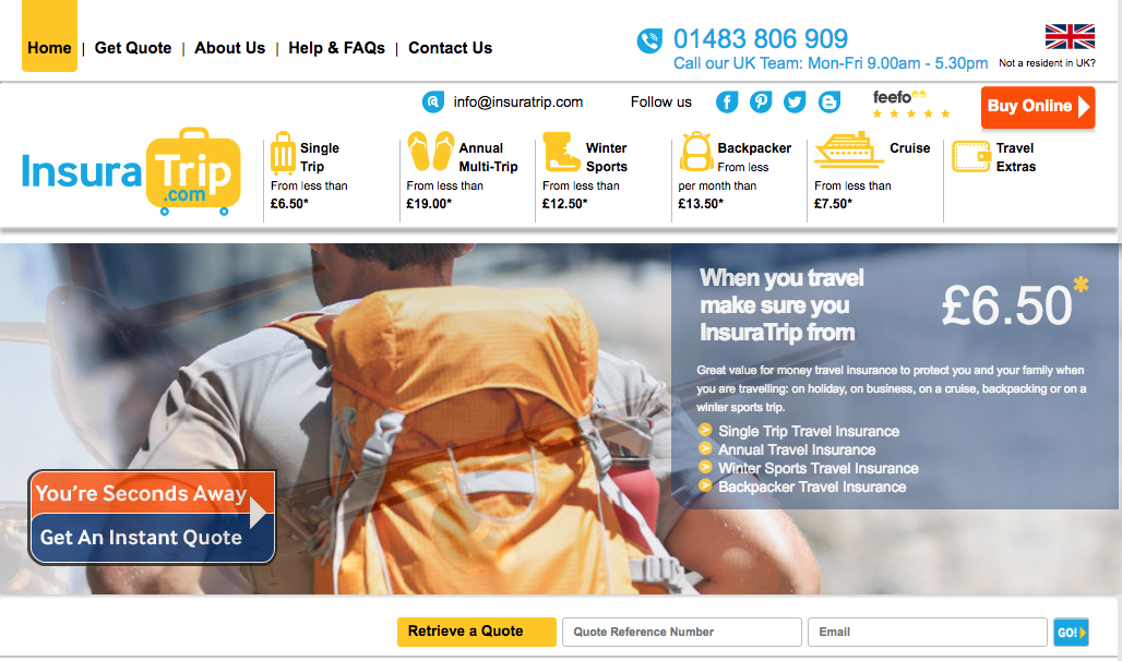
- This landing page fits into the mobile screen
- Most landing pages do not
- Mobile devices are being proliferated and needs to be accommodated
- It is the future and cannot be ignored
- This landing page does it well
- Most searches are done on mobile devices hence this is important to understand
- Everything is simple and clear on the small mobile screen
- No scrolling down
- The CTA is on the landing page
#12. AIG Direct
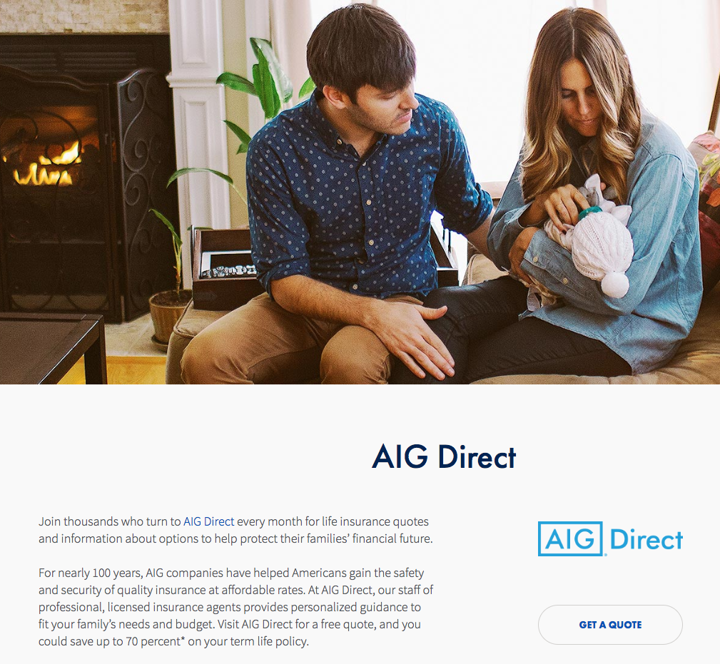
- A very clear and precise message on the headline “protect your family”
- We love our family so there is a message that would hit right into our heart
- An option with a benefit s given next
- Information upfront
- Trustworthy statement
- No hidden agendas
- Bona fide information on the table
- The CTA is good with the word “Get Quote”
- That should draw an immediate response
#13. AllState
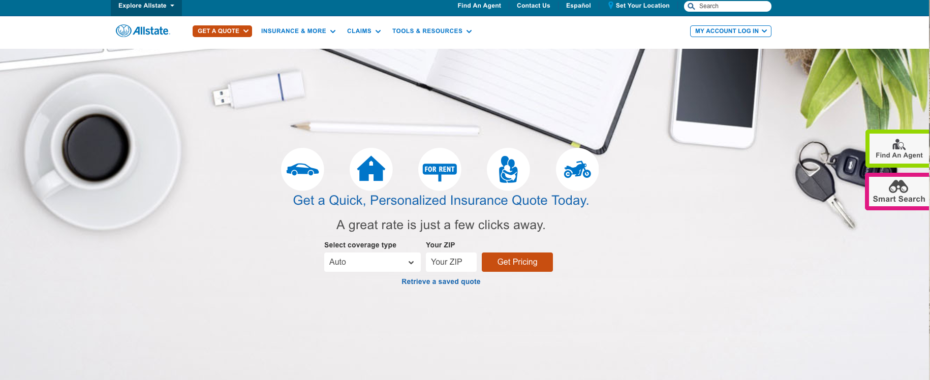
- The value message on the landing page is impressive
- A “saving” is the keyword and everyone likes that
- The CTA is satisfactory but could be better
- The image s good as well with an informal flavor
- A substantial saving of 45% is offered
- That should trigger immense interest
- It is for safe drivers so there is no catch in it
- Trust is displayed with an offer to a specific segment, “safe drivers”