
The maximum number of fishing lines that you would cast in a day, the better chances that you would have of catching some fish rather than the guy seated next to you.
He would cast just one reel and then when nothing is caught he packs up and goes home empty-handed, whereas you would be successful and take a few fish home.
The same goes for generating leads in any business, where you would need to cultivate the maximum quantity of leads if you are to get a few successful ones.
Likewise, when you create the opportunity to interact with the optimum number of customers it is very likely that you would be able to convert a few successfully.
We know that quantity and quality does not mix just like chalk and cheese but sometimes quantity would play a crucial role.
Especially when you have more leads than another it is imperative that you may be able to increase the conversion rate compared to another who would have a lesser number of leads.
So don’t always try to presume that quality supersedes quantity it could work the other way around too in some very conspicuous ways.
The landing page would be where the prospective customer comes onto your website and it is from here that you would need to ensure that you get them interested to engage with you.
We select a few landing pages from which you borrow some ideas, to model yours and ensure you reap success.
You could look at these and model your landing page on these lines for a more effective success rate.
It is well and good to borrow some ideas from others and that is what we are trying to do by looking at others who have effective built up their landing page.
1. VideoFruit
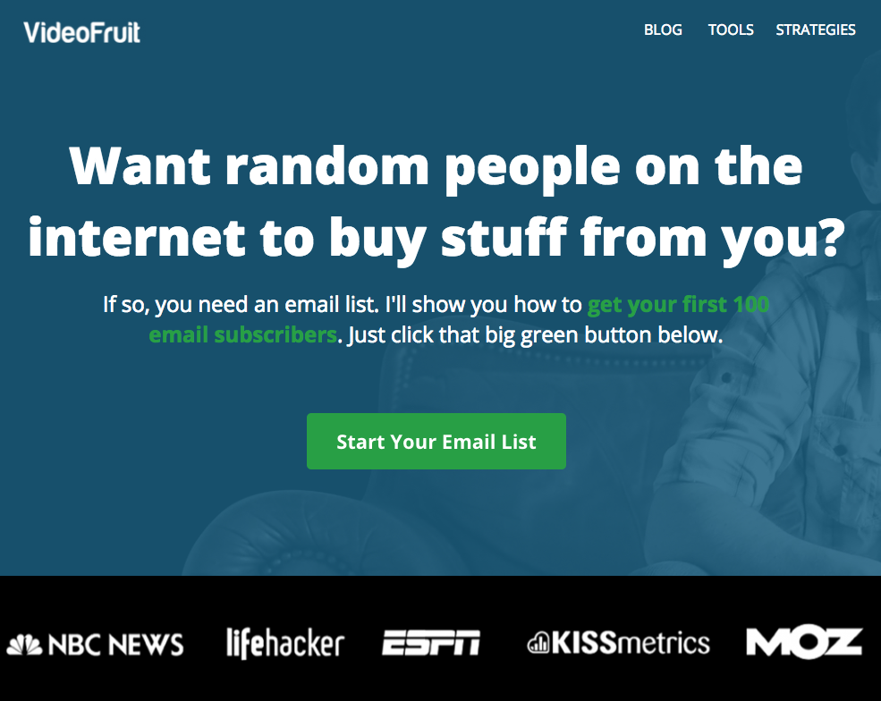
Targeting the prospect is very effective. A clear benefit, with a CTA “call to action” button prominently displayed, which would not be missed.
Has effective and catchy headline with very persuasive content which is very well placed before the prospect who would exchange,
2. ConvertKit

Some interesting words like “FREE” is used which would attract anyone to take a second look.
Dangle good questions to draw the attention of those prospects landing on your page and remaining there.
3. Drip
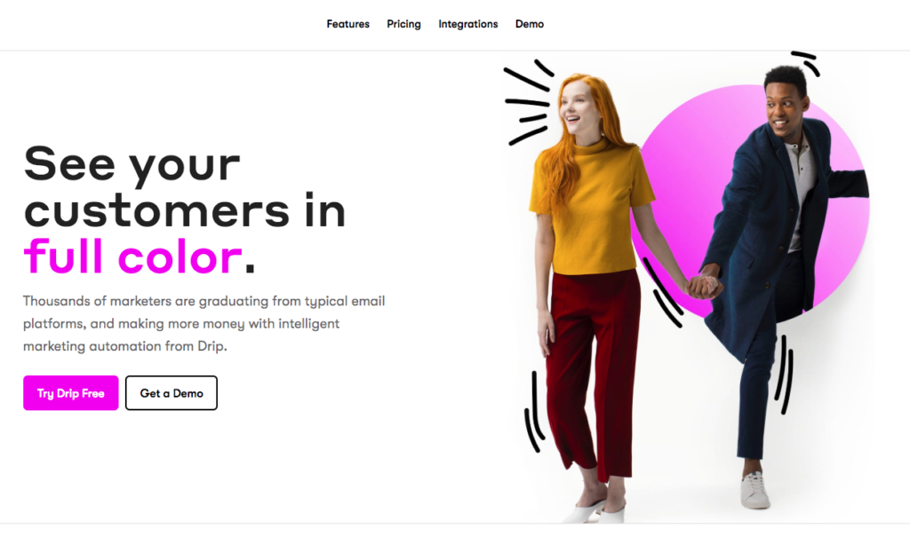
The word “FREE” plays a major role not that it matters but it plays on the psychological aspect of what we would always like.
Precise and quality information which was suspected is all on board.
4. Aura Dating Agency
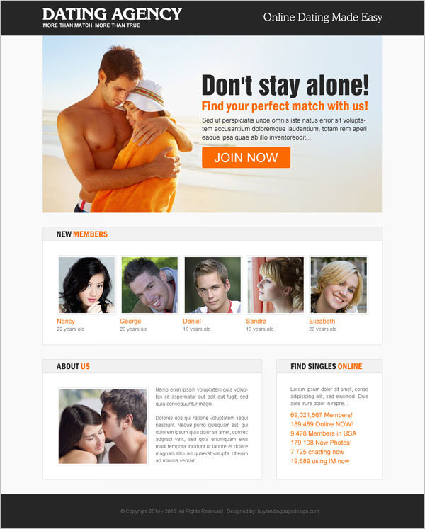
A very effectively designed CTA or call to action button which would not be missed by the prospect.
Well presented to the audience and is very simple way.
5. MeetEdgar
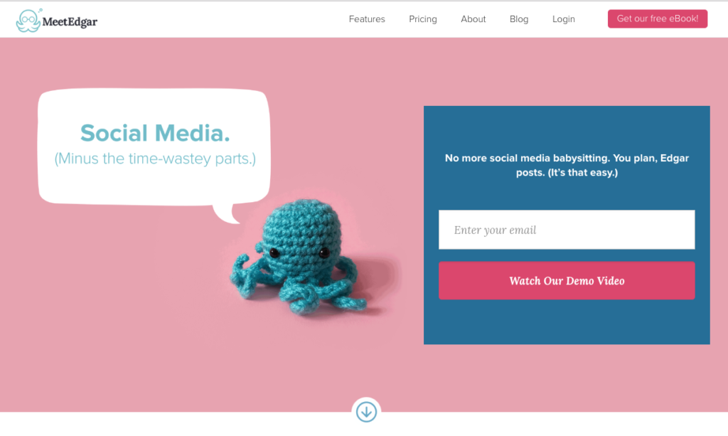
Very catchy headline “Saving Time” with precise information, the red CTA “call to action” button is very prominent in the center.
The former has brought on a need because time has become the essence in life today. The landing page is an ageing of many information and for those with a Nature in mind that is there two, children insured
6. MotleyFool
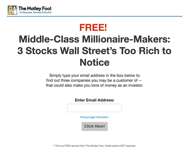
This a very simple and clean example to follow whereas the “FREE” word brings everyone to take special notice.
The landing page is very clear but the selected words nay be wrong instead of the CTA or call to action it is a “continue” which could be a bit confusing.
7. LandingFolio
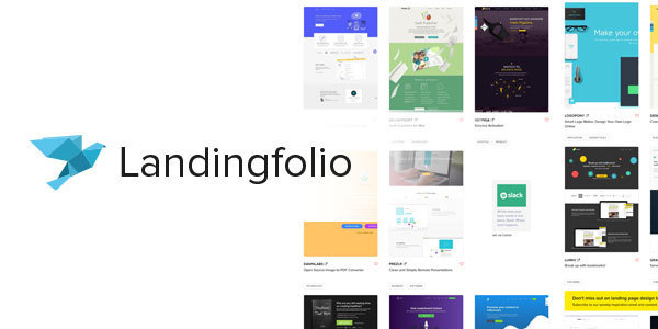
This has a very effective headline which shouts at you with a very smart and prominent text to bring the message home to the prospect.
The CTA “call to action” is working very effectively and is prominent and supported by the effective text.
8. IDoneThis

The text which sounds positive determines that the prospect is given statistics about an obvious fact that many have trust on this product.
There is very precise information available to all which could be used positively.
9. OutskirtsPress

Well and concise presentation with bullet points. The CTA –call to action could be improved on.
The text is good and simple to understand. Great promise in it and with the holidays
10. KlientBoost
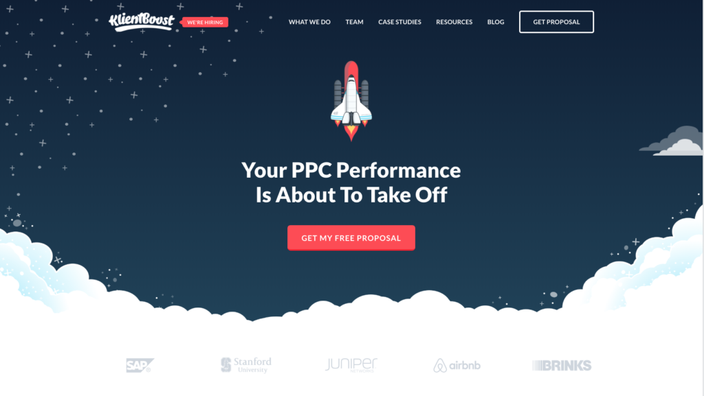
The theme is great and well-planned landing pages are great with good text balance. The headline stands out well with purpose.
The layout of the page with the CTA – call to action, is prominent and easy to see and engage. If your website is like this it is sure to draw
11. GKIC
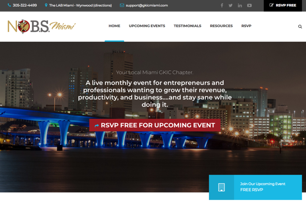
Interest is spontaneously created by a fantastic offer on the landing page which the prospect would find it difficult to let go.
The presentation s important and is tops.
12. Ryan Levesque
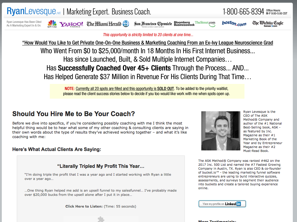
Well presented with a good look for any prospect landing and with simple text to convey the message.
13. LinkInfluencer
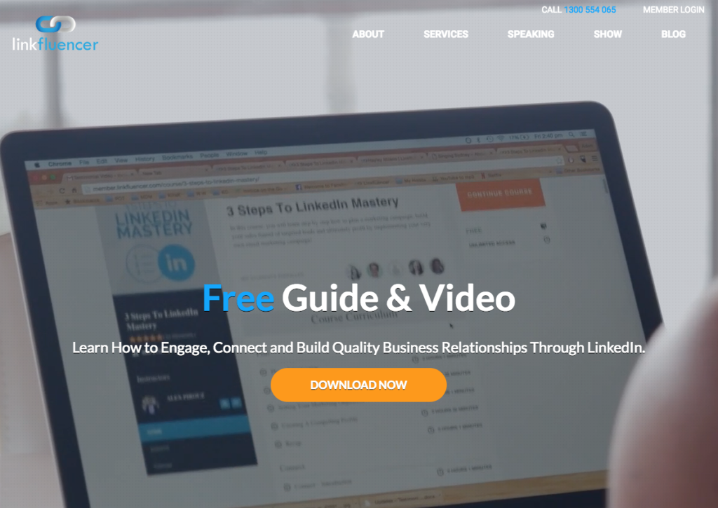
Great text and many things said in simple words with the CTA practically popping out to let prospects to engage.
It has upped the tempo recently and with very precise information the issue is well presented.
14. SimplyMeasured
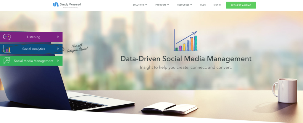
Great landing page with the CTA – call to action standing tall and handsome with some great text to convey a strong message.
Well presented in a very simple context to understand.
15. Louder Online

Good text showing an advantage to prospect to engage and enjoy and benefit. A FREE is also added which is what gets prospects to stand out without much do.
CTA is hidden and the message could be lost. The whole landing page is very eye cathing.